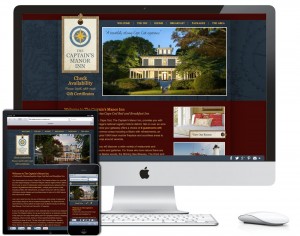
Trish from Captain’s Manor Inn knew that her four year old website needed an upgrade, but she wasn’t ready to give up on her design yet, so she called us to discuss her options. Being savvy, she had heard about responsive web design and wanted to know what it could do for her, as well as “sticky nav” and the benefits of HTML5. She also wanted to weigh the costs of new design against simply a responsive upgrade.
What is responsive web design?
 Responsive web design is the method of creating a website to serve the same targeted content to different sizes of screens, from large screen monitors to mobile phones and adapt the rest of the design to fit it all. The term “Responsive Web Design” hit the web in early 2011, but didn’t really take off as a serious idea until late 2012 with the candidate recommendation of HTML5 in December 2012. Our development team got to work on a solution, and soon after, Elk Mountain launched as InsideOut’s first truly ‘responsive’ website.
Before the responsive design trend, there were two options to view content on a web page from a mobile device; either the full-blown view of the page, which looks bad on tiny screens like smartphones, or a completely separate version of the site that was specifically made to be seen on mobile devices. While the latter was a solution, it wasn’t the best solution. It doubled to quadrupled the work for developers, and the same for any updates that were required. In essence, it was a waste of time and money, which is the bane of the working world.
Enter responsive web design. With the introduction of HTML5 and CSS3, new protocols were introduced, made with mobile devices in mind. I won’t bore you with all the technical mumbo-jumbo, but in the end, developers were handed the capability of programming smart websites, capable of adjusting the page dynamically, as to better serve content to any size of screen. These developments reduce the time and effort required to create and maintain the site being designed.
In short responsive web design is the design of a website that serves the same content to every device, without sacrificing the look, feel, and usability of the site.
I’ve heard about “Sticky Navigation” – what’s the deal?
Around the same time that InsideOut Solutions hopped on the responsive web design train, we began introducing our new websites with a new feature: “Sticky” navigation (or nav for short). The nav itself is a portal for visitors to peruse all of the pages on your site, and the concept has been around since the web began. We’ve taken it a step further, making the nav stick to the top of the page when you scroll down. Why is this important? It’s a usability perk, especially on mobile devices in conjunction with responsive web design. Instead of scrolling all the way to the top of the site to view another page, the ‘Sticky’ nav keeps the nav menu at the top of the window, always, saving time, and increasing the likelihood of visitors visiting more of your pages. More pages, more page views, better business.
You mentioned HTML5 and CSS3. Why do they matter?
Simply put, HTML5 and CSS3 are improvements made to the way we view the web. HTML was made the standard in 1990, with several revisions up to HTML4, which was made the standard in 1997. 15 years later in December of 2012, HTML5 was proposed as the new web standard. During those 15 years, we were introduced to smartphones, tablets, wide-screen monitors; an explosion of different web-ready devices. We also experienced the increase of importance in having a web presence, as everyone and their sister began using the web instead of phonebooks to find what they needed. HTML5 was designed with all of these in mind, a modern solution to the modern web. Learn more about HTML 5.
The Good Stuff
The best part of all this? The value you get from InsideOut. The cost to convert an existing site we built with responsive web design, coded to HTML5 standards with “sticky nav” starts at $2,500 (cost depends on size of site), while new custom designs with all these features start at $6,000. Since Trish was happy with the look of her site, she made the wise choice to select the upgrade. Within a month, the project was done, and Trish had extended the life of her website by at least 4 years.
If you have a WordPress site by InsideOut that you still love the the look of, and you’re interested if a responsive upgrade is right for you, please send us an email or give us a call. We will evaluate if your site is a good candidate for a responsive HTML5 upgrade, like Captain’s Manor was.
Responsive Web Design: it’s the responsible thing to do.
