Don’t let your beloved websites become outdated and inefficient. We know it can seem like a daunting task to re-do your website. Where do you begin? Can you take the exact same look and just move it to a better functioning site? For many of our clients, nostalgia associated with their websites blur their business vision. That’s where creative website design comes in. Finding a balance between historical importance and modern design techniques is pivotal in creating a website that the client loves aesthetically and operationally. And, so was the case for the website launches below. An understanding of what each website meant to each client inspired us to capture the true essence of each brand while guiding them toward future online success.
Asaya.org
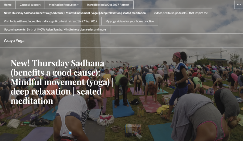
Asaya.org is a website for Anna Johns, a holistic yoga and mindfulness teacher serving the greater Washington, D.C. area. The purpose of her website was to have a place to maintain her teaching schedule and share inspirational writings. Asaya means subliminal intention in Sanskrit. Yoga is about embracing clarity and an appreciation for the natural flow of life. Anna’s website needed to emulate these philosophies. Unfortunately, she had a website that was not easy to navigate for website visitors nor for herself in the back end. The website was originally built by a volunteer student which meant it held sentimental value for our client. It also meant it was not built to professional standards. Photos and images overpowered text on web pages and navigation was confusing. Anna knew she would need a website that could easily help her accomplish her new goals.
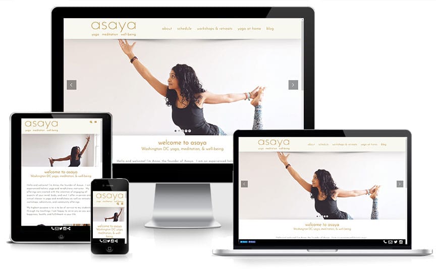
We were eager to have the opportunity to work with this client as yoga and wellness is an area of hospitality we have only dabbled in previously. Getting to know our client really gave insight into the type of website she wanted. Words like openness, calm, and flow were reoccurring themes. When you scroll through her website we want those words to subliminally shine through. As yoga is very much a personal journey, we wanted to make sure the website showcased Anna’s yoga journey and volunteer work. Our strategy was to combine a personal branding website with an inspirational/ informative website design.
Kellys Resort
Kelly’s Resort is a family-owned lodging icon on beautiful Lake Chelan in Washington state. With 200′ of waterfront and 4 docks, the resort had become a summer staple in the area. This year they celebrated their 71st season. Last year, they announced that the property would no longer be open to the public for day-use. They were evolving to a private property to better serve their loyal guests while creating a unique space on the lake for potential new guests. Kelly’s Resort is example of a company going through growing pains. Their challenge is to balance remaining true to their humble beginnings while embracing a modern approach to lodging. To guide the conversation and create a rebrand, a new website was a must.
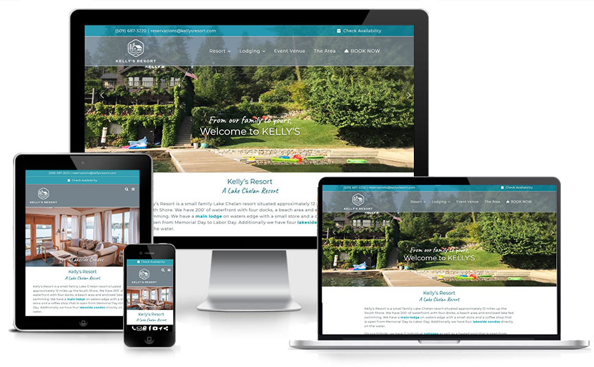
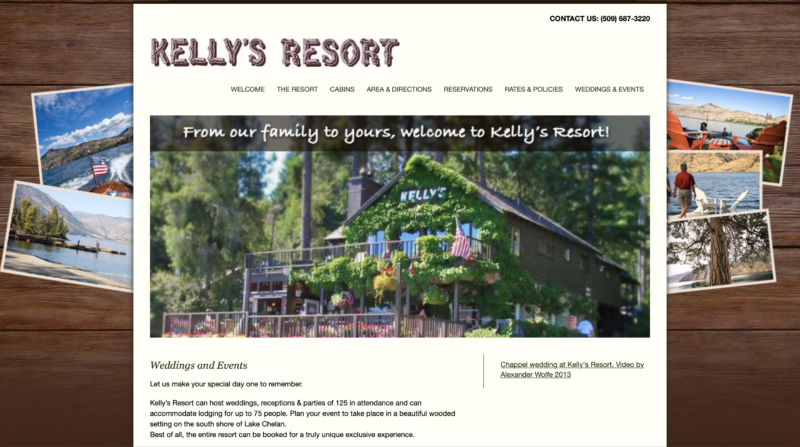
The former website was an HTML design with a wooden plank graphic as the background and snapshot photographs peaking out from behind the main text on each webpage for a camp in the woods feel. While very nostalgic, the website felt out of date and could not integrate videos that the client had began gathering for promotion. Our goal was to stay true to the “cabin in the woods” aesthetic that had served Kelly’s Resort thus far. We also wanted to embrace a bit of sophistication and exclusivity as the brand evolved with new vision and direction to include more weddings and formal events.
Laughing Horse Lodge
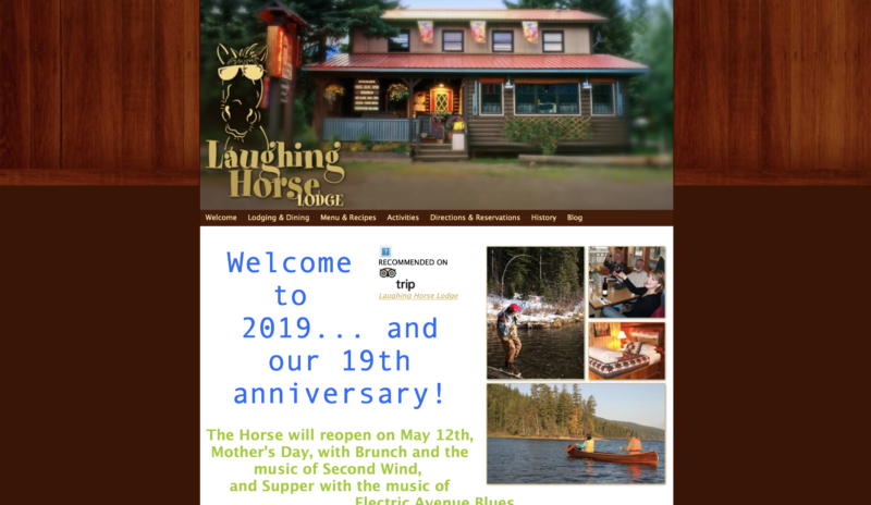
Located in Swan Lake, Montana, the Laughing Horse Lodge has been welcoming families and adventurers to the Rocky Mountains since 1999. Guests mainly visit for self-guided tours to Glacier National Park or trout fishing excursions. Knowing their rustic roots, our client did not want to veer too far from the down-home, inviting look that they were known for. While she wanted a modern functioning site she did not want too much of a “modern looking site”. She wanted the design to capture the feel of her property. As a current client of ours we were familiar with the product and were able to design a responsive website in less time than expected.
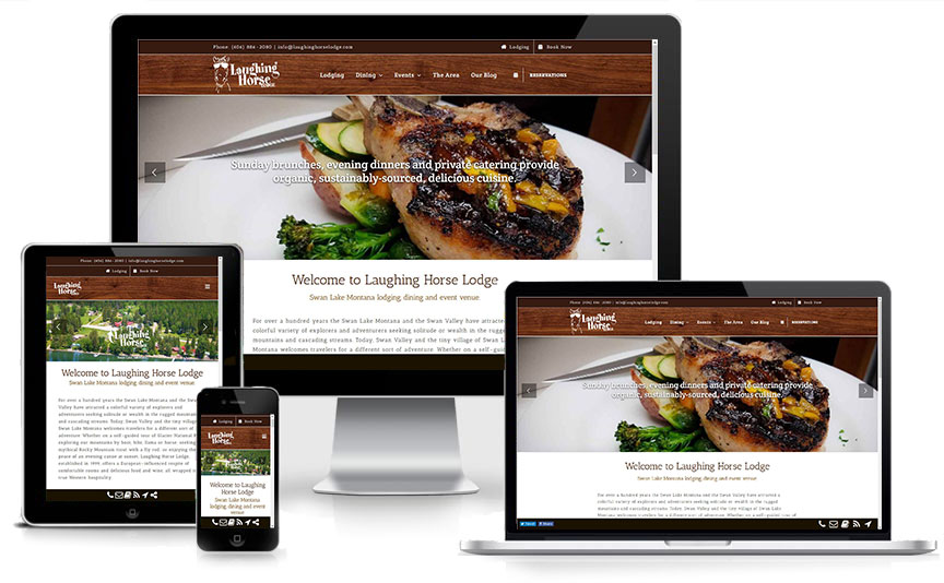
Lead designer, Beth Edwards, created iterations incorporating a palette of more shades of green to enhance the “bright & inviting” atmosphere. Yet, our client remained true to the brown palette including the faux wood background. As a compromise, the navigation bar was edited to have the faux wood backdrop and photographs including more greenery were chosen. Our client liked to post updates on their website pages instead of just their blog. Therefore, we added sections to the pages to make adding updates in an organized manner easier. The new site now showcases Laughing Horse Lodge’s brand consistently on any device and is able to grow with the company.
Is Your Website Outdated?
All of our websites follow the most up-to-date design and development standards. This includes responsive design, WordPress, HTML5, SSL certification, Accessibility statements, and Search Engine Optimization. With a website from InsideOut Solutions, you’ll rest easy knowing that your site is safe, secure, and serving your visitors. With a new design process and improved pricing launched this year, we are eager to help you transition your brand and exceed your company’s goals.
Are you looking for a new responsive website, SSL certification, ADA Accessibility Review, or other web service? Just let us know!
