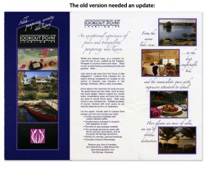
Lookout Point Lakeside Inn was down to their last box of brochures. Co-owner Kristie Rosset decided this was the perfect time to update the design of the piece. InsideOut had recently established a new look for her postcards and business cards. Now we had the opportunity to brand the brochure.
Kristie was happy with the current format–an 8″ x 9″ piece which folded in half to 4″ x 9″–but she was also open to other options. Staying with a finished size of 4″ x 9″ made the most sense since it would fit both standard display racks and business envelopes. But which format would work for Lookout Point? Rack card, trifold or bifold?
Rack cards: small but mighty
A 2-sided 4″ x 9″ rack card was the most economical option. Although on the small side, a rack card still has enough room for good photos, a map and short-but-sweet text. For most small inns, a rack card is the best choice.
Trifolds: a multi-tasker with impact
The trifold format (12″ x 9″ folded to 4″ x 9″) would work if it was important to emphasize multiple aspects of the inn. In Lookout Point’s case, the main aspect was the excellent accommodations (12 guest rooms and a condo), but the inn also hosted business meetings, weddings and fine dining events.
Bifold: right in between
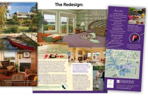
The current bifold was a happy medium for fitting text and photos. As far as impact and cost, it was right between the rack card and trifold. After thinking it over, Kristie decided to stay with the bifold. The format had already proven itself and, with focused writing and design, we could still showcase the main aspects of the inn.
The design: making it all work
Although Lookout Point had multiple facets to its services, the Big Idea was still its luxurious accommodations. The largest photos and the most text were devoted to this key aspect of the inn.
The secondary aspects, such as gatherings and fine cuisine, also made their mark on the piece with small inset photos and short captions. The back panel was the place to put quick reference information. It’s a hard-working panel that features contact info, a locator map, a list of amenities and other highlights of the inn.
The same fonts, colors and photo treatments used in the previous print pieces were used in the bifold. As a result, all the pieces work well together and reinforce the established branding. Since InsideOut was already familiar with Lookout Point, the design process went quickly and smoothly.
“You’ve made this process so easy. Thank you! – Kristie
InsideOut managed the printing of 5,000 brochures to ensure low cost, high quality and timely delivery.


