The web is growing fast, and new tools and techniques are being used all the time. When it comes to what’s online, it only takes a few years for what was once new, to become outdated. So how can you tell if your website needs a checkup?

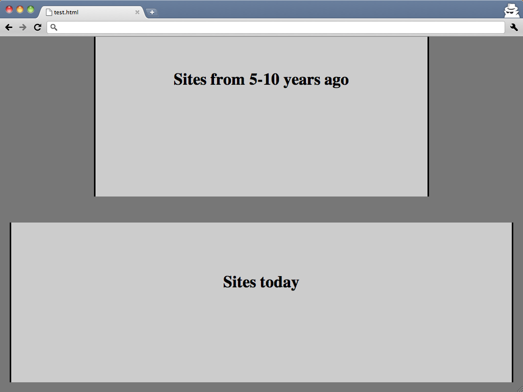
Sites that take advantage of today's smallest average screen size have space to show off larger photos
How wide is your site?
The average screen size today is larger than it was five years ago. This means that if your site was built in 2006, there’s probably some unused screen real estate you could take advantage of now.
If your site can be widened, this means that there could be room for larger photos. Plus, you might be able to sport a nice multi-column layout that’s not too cramped; these sidebars can be a great place to post positive reviews or quotes, as well as call-to-action buttons.
Does your site have a “table-based” layout?
Once upon a time, it was common practice to build a site using a “table-based” structure. This was a great way to control the layout of your site – you could control columns as you would in a spreadsheet. However, this is not the way modern sites should work. Why? Those sorts of layouts are much more difficult to maintain over time since a lot more code goes into building the layout. More code means longer page load times – something that search engines now take into consideration when ranking a website. Lastly, it’s not correct syntactically, meaning that tables should be used for “tabular data” like comparison charts, or the sort of information you might put into a spreadsheet.
Are your main links image-based or text-based?
Did you know that there are only a handful of internet or “web-friendly” fonts? With current technology, we can expand that number, but in the past, the only way to use a non-standard font was to save your text as an image. This might seem pretty harmless because humans can still read it even though it’s an image of text. But here’s the problem: search engines aren’t human. Granted, search engines seem to be getting smarter all the time, but there’s still a limit to what they can “read”. If your text, and especially important links, were created as images the search engines can’t “read” what your pages or links are about, which may reduce the link’s relevance and ranking.
Does your site depend on Flash?
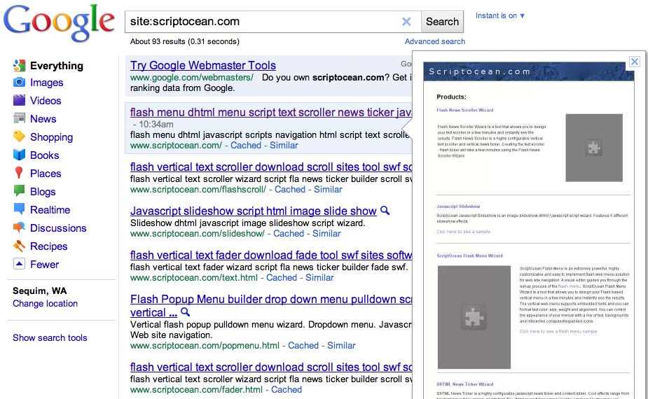
There’s no denying that Flash animation, when done well, is very eye-catching. But there are some things to consider, for example, Google’s relatively new site preview ability (that magnifying glass next to some of your search results). Google will attempt to get a snapshot of your site so visitors can quickly tell if this is what they’re looking for. But it can’t (at least not yet) capture Flash. Instead, it’ll replace what should be Flash with a gray block and a puzzle piece. Secondly, the ever-present iDevices (iPhone, iPad, iPod Touch) do not support Flash. Fortunately, many effects that were once only possible with Flash can now be mimicked using other methods like JavaScript. For example, simple features, such as a header slideshow or photo galleries, are implemented easily in JavaScript. These two websites use JavaScript to make their slideshow run: Inn and Spa at Cedar Falls and the Oregon Bed and Breakfast Guild
How can you tell where your site stands?
If you’re not sure how your site measures up to the modern standard, and if you’re interested in finding out, contact InsideOut Solutions at info@insideout.com to request a free report. In a week or less, we’ll review your site and let you know how it stands, and what steps you can take to bring it up to date. Please write “Website Standards Review” in the subject line of your email request.

