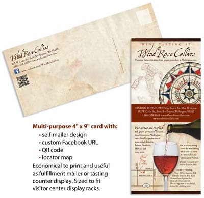
Wind Rose Cellars, a new winery in Sequim, WA approached InsideOut’s graphic designers about creating an information card to leave out on their tasting room counter. After talking with owner David Volmut, it was clear they needed:
- a display piece for the counter
- a print piece for local visitor centers’ racks
- a postcard for announcements
Rather than designing and printing three separate pieces, we suggested a single all-purpose piece: a 4″ x 9″ rack card designed as a self-mailer. David liked the idea of getting three uses for the price of one and decided to have InsideOut proceed with the design.
Matching to Existing Visual Branding
Since Wind Rose Cellars is just starting out, there weren’t a lot of existing pieces to match to. We decided to use their new Bravo Rosso wine label as a basis for the rack card design. The label had many elements that David liked and planned on using in future designs. So we used the same aged paper, compass rose illustration, fonts and colors to keep the look of the card consistent with that of the label. Because we had worked with David on the Bravo Rosso label, InsideOut already had all the design elements on file. This allowed us to get started immediately and helped reduce the overall design time.
A Lasting Print Piece
It’s expensive to have a print piece that needs frequent updating and reprinting. To avoid this expense, we kept the information general and didn’t include specifics (such as prices or a full wine list) that would need future revision. It was better to stick to the basics that included:
- a locator map
- a QR code
- a reference to their Facebook page
The map was drawn simply, avoiding excessive details that make a map too large (there’s not much space on a 4″ x 9″ card) and too confusing to look at.
The QR code points smartphone users straight to the winery’s home page. No need to type out windrosecellars.com—just scan the code and there you are!
For the Facebook address, we sent David easy-to-follow directions that allowed him to set up a Facebook custom URL for free. The custom address is shown on the card with the Facebook icon and /windrosecellars next to it.
On the front of the card, a glossy coating keeps the colors from fading and gives the piece a substantial appearance. On the back, the card was left uncoated for ease of writing.
Self-Mailer Savings
No need to buy envelopes—the self-mailer design makes the piece a mail-able postcard. To prevent problems with delivery, placement of the return address and the vertical line indicating the message and label areas follows Post Office guidelines.
There’s still plenty of space on the back for David to customize the message on the card. He can use desktop-printed labels or handwritten notes to announce events or special deals.
Ready for Display
At the tasting room, the rack card can be put in a vertical display so it takes up less room on precious counter space. Guests can pick up the card to keep as a reference or they can mail it out and share the information with others.
The 4″ x 9″ dimensions are also the correct size for visitor center display racks. Space is at a premium in most visitor centers. They’ll often reject pieces that are too large for their display racks. Also, in often-crowded racks, the top third of the card is usually all that’s visible. With this in mind, the Wind Rose Cellars rack card features the name and main offering (wine tasting) in the must-be-visible top third.
After a few revisions, David approved the piece and 2,500 rack cards were printed. The cards now serve as his primary print marketing piece, promoting his new business in the mail and on display.
Click here to view pdf: Wind Rose Cellars Rack Card

