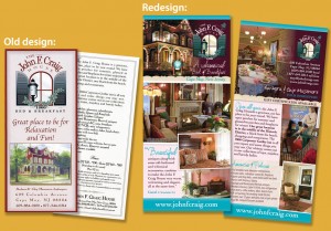
An update for a whimsical B&B
John F. Craig House is a Cape May, New Jersey inn owned by Barbara and Chip Masemore. They’ve created a fun yet relaxing atmosphere, preserving the building’s Victorian charm while adding the whimsy of retro signs, old toys and colorful touches.
Craig House’s old rack card was straightforward and informative, but it had been printed in quantity before the innkeepers had professional photographs. Now Barbara and Chip were running low on cards, plus they had a collection of excellent photos. It was time for an update!
Telling a story in a small space
A 4″ x 9″ rack card is a great fit for standard rack displays and envelopes. But even on a double-sided card, that’s not a lot of room. So what to do?
We let their photos do the talking. The front of the card features the holiday lights for which they’re famous. The back shows off the lovely dining room. All the photos were carefully selected for what they could say about the inn and its amenities. By contrast, it would have taken an unwelcoming wall of paragraphs to say the same thing with words.
The text we did use was trimmed from the original rack card. We stuck with the essentials: contact information, a descriptive rave review, an edited list of amenities and policies, and a short “about us” paragraph.
The deep maroon, turquoise and pink came from the colors of the house. We also took the quirky/elegant look of the decor and carried it into the new design by tilting photos, using casual-looking script and mixing type treatments.
The result:
“I love the design!” – Barbara Masemore
We printed 10,000 to last her several years and many passing tour groups. InsideOut is currently redesigning John F. Craig House’s Web site, incorporating elements from this rack card and keeping the branding consistent, quirks and all…

