Your Sign Is Not Your Logo
The sign at the front of your inn has one main function—to be noticed by people passing by. Your front sign is important, but your logo is more critical because of its broader function as a marketing tool. A logo is more than a picture next to the name of your business. It’s a symbol that represents your organization across all media—from your inn sign outside, to your website online.
Your Logo Is Not Your Brand
Logos are symbols that are seen. But brands are felt emotionally. Your brand is the perceived personality of your business. For example, the logo for Apple® is a simple outline of an apple with a bite out of it. But their brand is “youthful, innovative, fun, modern, creative.” The clean simple lines of the Apple® logo express these brand qualities visually. Successful companies invest millions on their brands and logos because of the impact a positive (or negative) impression has on their bottom lines.
Good Logo, Bad Logo
A good logo should score high on looks and technical points. In the world of branding, “good looking” means the logo attractively and accurately reflects the personality of a business. On the technical side, a good logo works well both large and small, in print and online. That means it’s a vector logo whose design elements are clear and legible even at small sizes. [Learn about vector logos.]
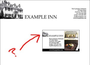
If you want a good logo, avoid using the elaborate illustration on your stationery or inn sign. Once that drawing gets shrunk down to fit on a business card with a bunch of contact info, no one will be to tell what that fancy drawing is.

on the stationery, but becomes a gray blob
when scaled down to fit on a business card.
Also, playing around in Photoshop is a lot of fun, but the type of image it produces means you are limited in how large you can reproduce your logo. If you need to create a big print ad or outdoor banner, your raster logo won’t be up to the task. [Learn about raster logos.]
Bad Logos Cost You Time & Money
What happens when your logo isn’t up to the task? Eventually, some designer will charge you extra and/or take longer to complete your design work. For professional designers, your logo provides a summary of the look, feel and colors your business uses to describe itself. Having this “blueprint” as inspiration speeds up the design process. Creating a website, printed card or signage without this critical element is a bit like trying to build a house without a plan. It will take additional time to research all the information that the logo would have provided. The likelihood of extra revisions is also much higher since the designer will be starting from scratch. In addition, a logo that isn’t well constructed technically will cost more time/money because of the extra time spent working around technical problems.
Use Your Good Logo Well
Once you have your good logo, use it well! Don’t hide it. Instead, use it consistently across all your marketing materials. For prospective guests, matching web and print materials look professional. But more importantly, they convey a consistent message about the experience you’re offering. Consistency is key when a prospective guest is considering your property versus your competition’s. If your site looks great but your rack card looks different, prospects may wonder which one is the real inn. The best way to avoid this “moment of doubt” is to make sure your printed and online marketing pieces are branded consistently. Click here to see examples of branded marketing materials.
There’s a lot more to branding and logo design, but hopefully this introduction has provided you with a good start. If you ever have any questions about your own logo and branding, contact InsideOut. We can assess your logo for free and give advice on how you can create a successful brand.
