
The launch of a new Google mobile-friendly algorithm is scheduled for April 21, 2015. The official statement from Google indicates that it is critical for website owners who are marketing to mobile device users to make sure their website is ready for this change, or lose visibility in and traffic from Google mobile search.

What Is the “Google Mobile-Friendly” Algorithm?
In this new algorithm Google defines “mobile” as smartphone devices only and does not include:
- Tablets, which Google considers a different class of device
- Multimedia phones, which are mid-grade phones with HTML5-compatible browsers, but don’t support all features
- Feature phones, which are low-end phones that have web browsers unable to display webpages in their normal desktop format
One thing to note: Google has stated that recommendations are geared toward smartphones, but they also encourage website owners – when they feel it appropriate – to follow the same advice for multimedia and feature phones.
What Are Smartphones, According to Google?
Google defines smartphone as devices running Android, iPhone, or Windows Phone operating systems with web browsers that function similar to desktop computer browsers and able to display webpages that conform to HTML5 specifications.
What Does a Website Need in Order to Be Considered Mobile-Friendly by Google?
- Google needs to know your website can be easily read on mobile devices. This means your website must be either a responsive design (something Google states is their recommended design format for websites) or otherwise able to display a mobile-only version of the page.
- Google needs to be able to “see” everything behind the scenes. This means Googlebot (Google’s web crawler) needs to be given access to read not only the HTML, but also CSS, JavaScript, etc. used on your website.
- Your website needs to avoid “common mistakes” that hurt the mobile user experience. Among these mistakes are slow-loading mobile pages and making Flash video the bulk of a page’s content.
How Can I Tell If My Website Is Mobile-Friendly According to Google?
Google provides online tools for evaluating your website’s compliance with the Google mobile-friendly algorithm. Be sure to use the mobile-specific addresses of your website in your tests if it is not a responsive website.
Google is not shy about telling why your website is not mobile-friendly.
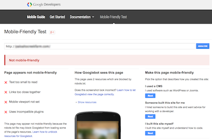
Google Mobile-Friendly Test
This tool does just what the name implies: it evaluates your website’s mobile-friendliness. Test results provide specific suggestions for improvements wherever there are problems, such as:
- Text too small to read
- Links too close together (i.e. not “thumb friendly”)
- Mobile viewport not set
- Uses incompatible plugins, etc.
Click here to evaluate your website with the Google Mobile-Friendly Test.
Google Pagespeed Insights
The Google PageSpeed Insights tool tests and scores the page load speed for both mobile and desktop versions of your website. It also offers suggestions for improvements. When looking at scoring by this tool keep in mind that scores are subject to change depending on how much traffic is currently accessing your website. It is also important to remember that some websites, such as those for our clients in the B&B inns, dude ranches and destinations industry, tend to be image heavy and a balance of speed versus user experience means getting a passing, not excellent, score is good enough.
Click here to test your website with Google PageSpeed Insights.
Google Webmaster Tools Mobile Usability Report
Websites that have a Google Webmaster Tools profile will automatically receive notifications of mobile-friendly issues in this report.
InsideOut Solutions Can Help Your Website Survive and Even Thrive in the New Google Mobile-Friendly Algorithm
 If your website is not mobile-friendly per Google’s new algorithm, you can expect your mobile search performance to suffer and that means lost traffic from the ever-growing mobile user marketplace – just have a look at the internet usage by device graph from StatCounter to see the trend.
For our managed hosting clients who have a WordPress-based website, but not responsive and with no mobile website feature, InsideOut Solutions is offering a temporary solution with our custom mobile website plugin that can be installed on their current website as a temporary fix when purchased with the long term solution: a responsive website redesign or upgrade.
Contact us to learn more about how we can help your website stay up to date with Google’s ever-changing standards.