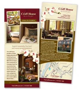
The Croff House is a Victorian home with a beautiful and comfortable updated decor. Owners Duncan Calhoun and Russell Gibson worked with InsideOut to create a great web site that captures the contemporary feel of the inn and showcases its luxurious amenities. With the web site completed, it was time to create a print piece that could do the same job in a much smaller space. Again, they turned to InsideOut — this time, for the design of their 4″ x 9″ rack card.
Strong branding with matching marketing pieces:
Print designer Jennifer Lozada transferred the logo, colors, fonts and layout of the web site to the much smaller 4″ x 9″ print format. Rather than cramming the space with text, she let the photos do most of the talking. Open spaces (“white space”) in the layout draw the eye to the most important information. White space is key if you want to convey elegance and sophistication. Even with the “blank” space, text and photos, there was still room for a helpful locator map. Good feedback from the owners helped refine the map, text and photo selections.
The result: The web site and rack card are a match, conveying a consistent message. The owners decided on a quantity of 5,000 cards. InsideOut managed the printing to ensure quality, affordable cost and speed of delivery.
“It’s perfect!!!!” – Duncan
“The rack card looks great.” – Russ

